Back to Digital Ageism in Home Automation and Entertainment
Gallery: Digital Ageism in Home Automation and Entertainment
Visual examples and detailed explanations
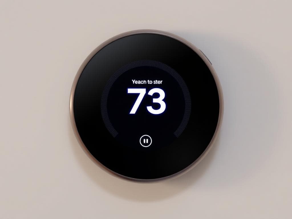
Controlling home temperatures
This interface demonstrates excellent design principles for older adults. The buttons are large and clearly labeled, the text is high contrast and readable, and the layout is simple and intuitive. The color scheme provides good visibility without being overwhelming.
Controlling lights
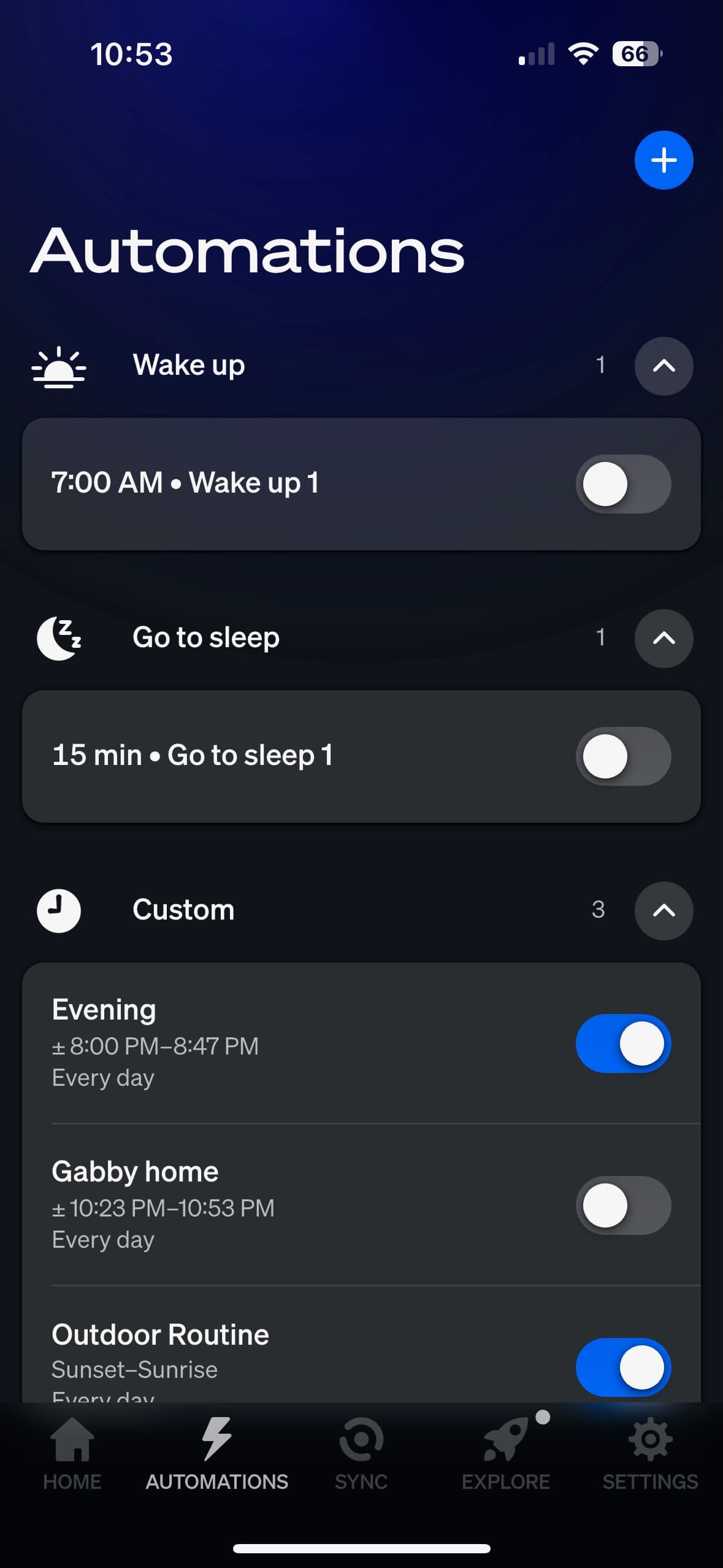
Automation is all over the place
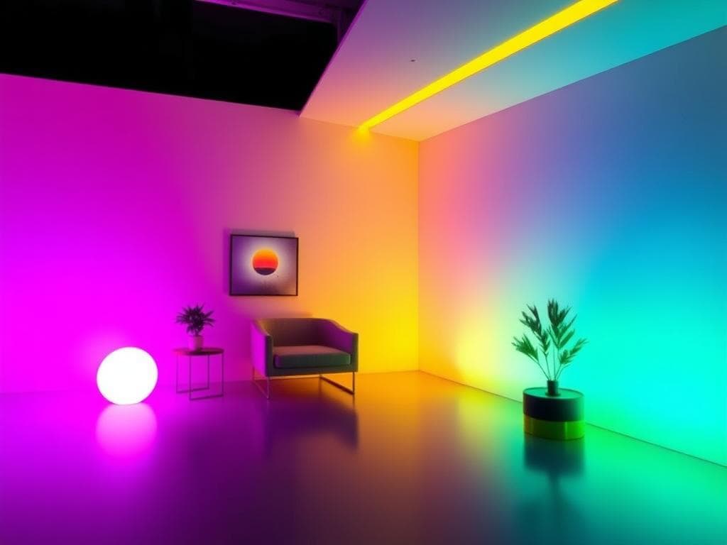
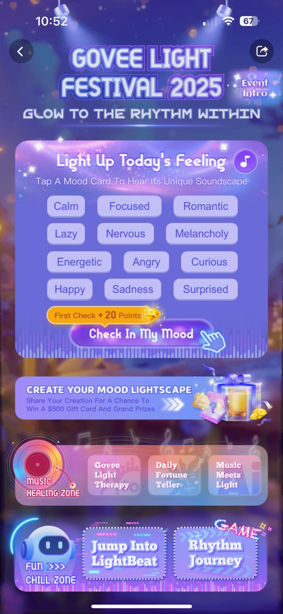
Having fun with lights
This interface shows common problems that create barriers for older users. The text is too small, buttons are cramped together, and the color scheme lacks sufficient contrast. The complex layout with multiple options creates cognitive overload.
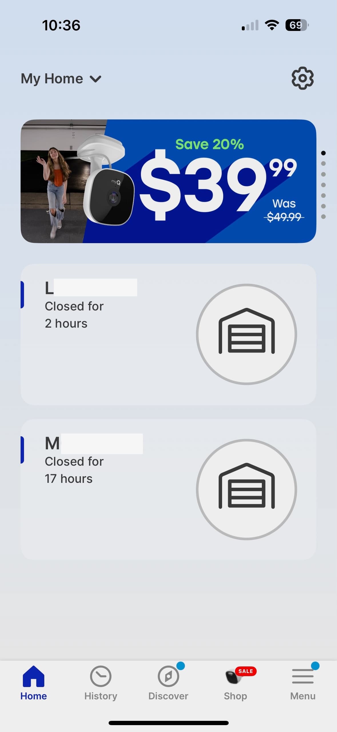
Opening and closing garage doors
This example shows how proper navigation design can help older adults. Large touch targets, clear visual hierarchy, and consistent placement of common functions make the app much easier to use.
Voice Control Interface
Voice control can be a great equalizer for older adults, but the interface must be designed thoughtfully. This example shows clear visual feedback, simple commands, and fallback options for when voice recognition fails.
Alarms
This alarm interface demonstrates the importance of clear visual feedback and simple controls. The large, easy-to-read time display and prominent buttons make it accessible for users of all ages, while the intuitive layout reduces cognitive load.
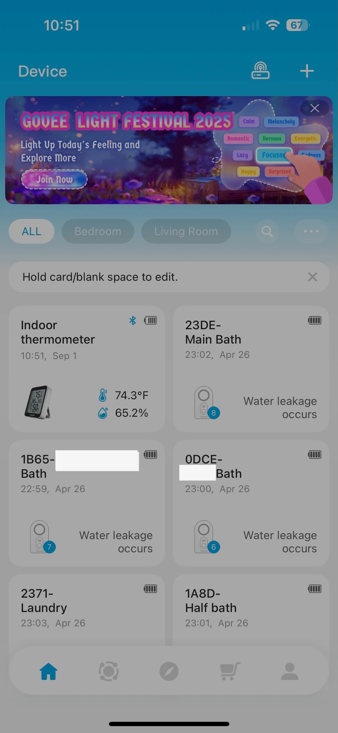
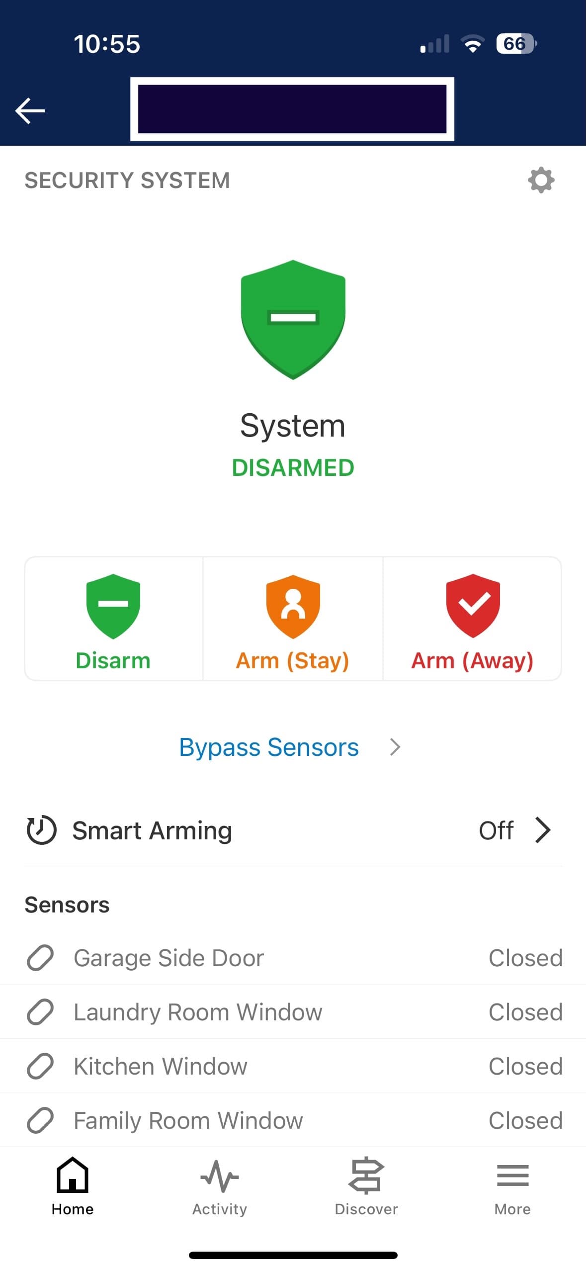
Leak Detection
This leak detection interface shows how critical safety features should be designed with accessibility in mind. Clear status indicators, prominent alerts, and simple navigation ensure that users can quickly respond to potential emergencies regardless of their technical comfort level.
Extra monetization
This monetization interface illustrates how additional features can be presented without overwhelming the core functionality. The design maintains simplicity while offering optional enhancements, ensuring that the primary user experience remains accessible and intuitive.
← Back to Article
8 gallery items